We're bringing out a whole lot more video tutorials to help you learn Cocos Creator and we start with building a radial progress bar as in the example below. This can be used in many different games like a health bar, timer, power skill, or many other ways.
Here's an example of a radial progress bar from the Cocos developer valiancer. He also helped in the creation of this tutorial.
In our tutorial, we're going to build a progress bar that has two buttons that will count to one and ten, and a reset button so we can start over again.
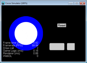
If you would like the full version of this project, download here.
Video tutorial
For those following along with the video, here are the steps to build a radial progress bar:
First, you will need three different image files. a background circle, a foreground circle, and a button. Make sure to add the foreground circle over the background circle so it looks similar to the example shown above.
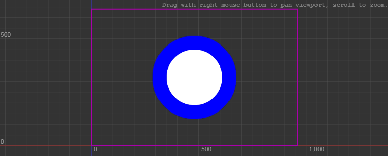
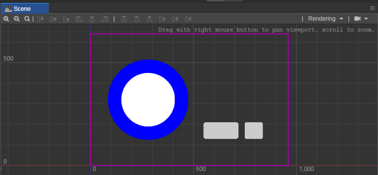
We moved these circles to the side so we can add two buttons using the same image file. We can then use the "Rect Gizmo" (Hotkey T) to shrink the second button to give it a slight change. If you did it correctly, it should look like this:
Highlighting the background circle, and let's look at the properties.
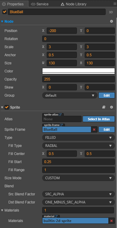
In the Sprite component you will need to edit the following:
- Type - Filled (Filled will allow you to fill up the circle by percentage)
- Fill Type - Radial (It's a circle, so we would like it filled by the sector)
- Fill Center - X at 0.5, Y at 0.5 (the center of an image is located here)
- Fill Start - 0.25
- Fill Range - 1 (Must be between 0 and 1)
- Size Mode - Custom (This allows us to edit it)
If you would like to know more about the Sprite component, click on the dictionary found with the component.

Since this is a progress bar, we have a component to help you use it. Go to the "Add Component" button at the bottom of the properties and in the UI section, choose "ProgressBar"
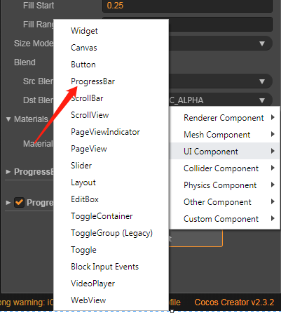
Next, add the Background circle as the "Bar Sprite" and change the "Mode" to "Filled". Change the "Total Length" and "Progress" to 1.
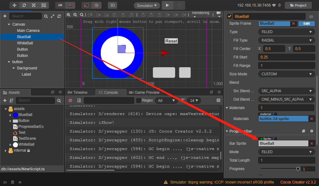
To edit the fill of the circle, we will need to add a custom component, to make one, let's add a TypeScript file to your Assets Library and name it "ProgressBarEx"
In the code, change the header to:
@ccclass export default class ProgressBarEx extends cc.Component {In the properties add:
@property(cc.ProgressBar)
    bar: cc.ProgressBar = null;
    _from: number = 0;
    _to: number = 0;
    _duration: number = 0;
    _elapsed: number = 0;
    _percent: number = 0;

    _tween: cc.Tween = null;
For the onLoad functions, add:
start() {
        this.enabled = false;
    }

    isDone() {
        return this._elapsed >= this._duration;
    }

    progressTo(duration: number, percent: number) {
        if (percent < 0 || percent > 1.0) {
            return;
        }

       this.tween(duration, percent);
    }

    tween(duration: number, percent: number) {
        if (this._tween) {
            this._tween.stop();
        }

        this._tween = cc.tween(this.bar).to(duration, { progress: percent })
                        .call(()=>{
                            this._tween = null;
                        })
                        .start();
    }

    action(duration: number, percent: number) {
        this._from = this.bar.progress;
        this._to = percent;
        this._elapsed = 0;
        this._duration = duration;

        this.enabled = true;
    }
For the update section, add the following:
    update(dt) {
        if (this.isDone()) {
            this.enabled = false;
            return;
        }

        this._elapsed += dt;

        let t = this._elapsed / (this._duration > 0.0000001192092896 ? this._duration : 0.0000001192092896);
        t = (1 > t ? t : 1);
        this.step(t > 0 ? t : 0);
    }

    step(dt) {
        let percent = this._from + (this._to - this._from) * dt;
        if (this._percent != percent) {
            this._percent = cc.misc.clamp01(percent);
            this.bar.progress = this._percent;
        }
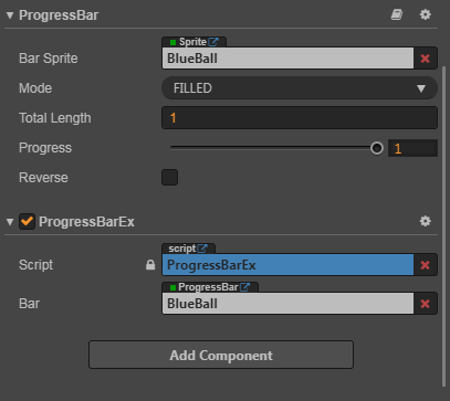
Now we have the ProgressBarEx file done. Save the file and return to Cocos Creator. We now need to have the progress bar able to talk to the buttons. Let's add the "ProgressBarEx" to our components of the background circle and add the same circle as the bar
Let's start working on the buttons. Take the left button and give it animation. Select the button and use "Add Component" to add a "Button" from the "UI Component"
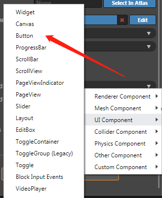
Next, add a transition to animate the button and a click event to have us progress the circle.
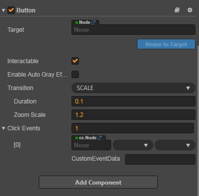
To control these click events, we need to build more code. In the Assets library, add another Typescript file and name it "TestScene". Let's enter it and add some code.
Before entering the class, remember to add this to the top:
import ProgressBarEx from "./ProgressBarEx";This will add the properties of ProgressBarEx to your code. Now change the class to "TestScene"
@ccclass export default class TestScene extends cc.Component {For properties, you only need to make two:
@property(cc.Node)
    nodeBar: cc.Node = null;

    _percent: number = 0;
onLoad just needs one:
start () { }And update just needs three functions:
  clickOnePer(){
        this._percent += 0.01;
        this.nodeBar.getComponent(ProgressBarEx).progressTo(1,this._percent);
    }

    clickTenPer(){
        this._percent += 0.1;
        this.nodeBar.getComponent(ProgressBarEx).progressTo(1,this._percent);
    }

    clickReset(){
        this._percent = 0;
        this.nodeBar.getComponent(ProgressBarEx).progressTo(1,0);
    }
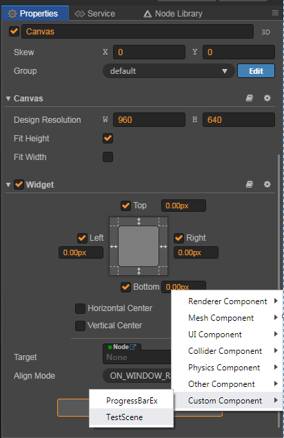
Save the Typescript and come back to Cocos Creator. Add "TestScene" to the Canvas so that it is global to all components. You can add it from the "Custom Component" area.
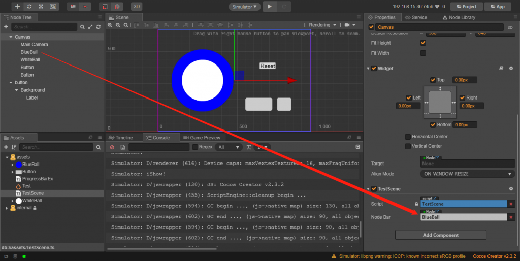
Add your background circle to the "TestScene" component and that's it!
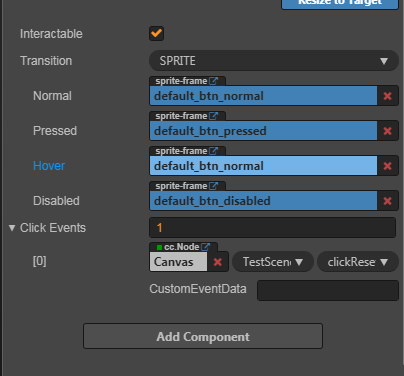
Now you can go back to the buttons. Choose the left one and in the "Click Events" of the "Button" component, drag the Canvas node into the "cc.Node" area. You can then add the TestScene component from the next option and then the "clickOnePer" function call.
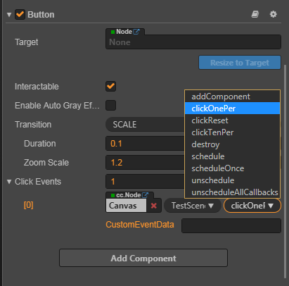
Do this similarly with the other button, but choose the "clickTenPer" option.
We are now only missing the reset button. Go to the Node Library and drag a button node onto the Scene.
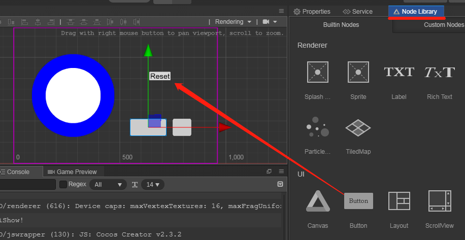
You can edit the text from the "Label" node inside the button and edit the size. You then can go to the "button" node and change the "Click Events" to 1 and repeat what you did with the other buttons, making the event "clickReset".
And there you go! Save the project and run in the simulator. If you are still having trouble, the full version of the project is available at the top of the page. Enjoy your time playing with this and hope to see it in your next game.

